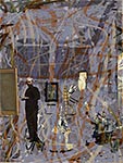
Studio Boogie Color, ink on paper, 11x14 in.
2004 (Aug-Dec) | 2005 (Jan-May) | 2005 (May-Aug| 2005 (Aug-Dec) | 2006 (Jan-Apr) | 2006 (May-Dec) |
2007 (Jan-Aug) | 2007 (Aug-Dec) | 2008 | 2009 | 2010 | 2011-2012 | 2013 | 2014-16 | 2017 | 2018 | 2019
2008
1/30
What the trip to Florida had to do with it, if anything, I don't know, but The Unknown Fugue "solution" came to me while down there. Today, I attached the tar piece. I will paint into its edges with the black paint I made, making it emerge from the chaotic field of strokes. I went through paint scraps, looking for the thing I would need in the upper right. Nothing, nothing, nothing....then, something that resembled Gomorrah in the Noonday Sun, the piece of 40 years ago that I realized I liked as I scanned in old slides a while back.
Many minutes and arrangements went by as I worked out where the tar and the sun should go. It ended up that the bottom angle of the tar didn't line up with the sun-like element, as I'd wanted. So, that suggested another idea: have something enter from the top, and line up with the tar. That something became a small stroke of life colors, blues, greens, and earths. It's nice and small, and probably won't be seen at first.
Finally, a scrap of paint, earthen-colored, got laid into the tar. It's the horizon line / mountains that I like so much. Next time in the studio, I've got to get the tar to "emerge," and then I think it's finished.
2/15
The tar and sun sat up on the surface too much, so I built up strokes around them to make them look as if they were emerging from the ground. The volcanic, biological feel is better, and the esthetics are much better.
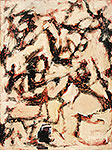
In looking over old work, I discovered I had slides of some of my programmed computer pieces from the early 1980's. One work made row after row of random colors and lines, top to bottom. When it was finished, the pieces had a Pollock "feel." Makes one wonder about the human need to organize, how rigidity (rows) can end up looking spontaneous, and how perception makes art.
2/19
Having a good struggle to get the tar piece and the sun piece to work properly with the rest of the main field. The added paint worked somewhat, but it was obviously added on, although it came from the same batch of color as the main field. After some brush dancing to get the strokes to blend in and another layer of varnish, it looked better, but it was still a struggle to see whether the pieces were emerging or being pressed into the field. I think I'll keep that, rather than adding another layer of paint and varnish to make everything meld.
2/22
One more look at The Unknown Fugue, but I think I will leave the differences between the newer, "added into" strokes around the tar and sun in. From some viewpoints they can be seen, while they are invisible from others. Fits the idea of the piece.
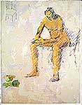
Sketched Thrower as a study for a possible addition to the new computer piece, Fossils Now. Got more and more gestural and violent, perhaps as an unconscious bridge between Fossils Now and The Unknown Fugue. All I know is that when I scanned it and dropped it into Fossils Now, it clicked, even to picking up on some subtle motion in the ground. Still needs work, but on the way!
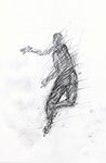 Thower
  Fossils Now
2/25
The Unknown Fugue, is finished. The final MSA varnish makes the suface just right: just slightly different around the tar and sun.
2/27
I've put Yusho's Landscape (1602) screens into Fossils Now. ![]()
Where his Zen tradition inspired him to create emptiness as a peaceful disintegration of the illusionistic world, my work is more contemporary American, the spaces more quantum. Our ideas are somewhat the same, though. What we perceive is only part of what's there, somewhat like the visible universe being only 10% of the whole universe.
3/4
Started two more paintings, off the Zen-gestural blacks of the previous piece. One a vertical, although I may rip that up and attach part of it as folds on the other. Except, I like the vertical, combining the calligraphic and the idea of the Phoenix bird.
Also did a small piece for Ruth Horwich's birthday, at the request of the Hyde Park Art Center. It has Ruth (or Rue, or Ruta) down in the right corner. Given her age and her vitality, I think this derivation from Sunset Viscera works,especially the implied triangular connections between the people looking at the sunset, the "eternal door" on the left, and the central man's gaze down at the flower.
3/12
One of my two new painting starts has turned in a new direction. After looking at an old print, "Queries," with its calligraphic aspects, I thought how much the marks in the painting resembled a rising calligraphy of an unknown language. I'm calling the painting "Beautiful Questions."
 Queries, monoprint, 13 x 12 in
 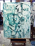 Beautiful Questions acrylic 48 x 36 in
3/13
Fossils Now, computer archival print.
Finished this piece by getting the right colors in the main field, colors that would be in sync with the focus of the piece. The fossil was subdued, to let the Thrower become more important, and it was placed, somewhat hidden by the main field in the upper left, strengthening the thought/feeling as well as the composition, as if these can be separated. The tape took a while to get spotlighted properly as the keystone, and a "planet" appeared, geometricized in part. Toned down and pushed forward parts, until all looked right.
3/27
Put aside several early silkscreen monoprints, for use in the black series. If I can honor Kieffer, why not images more close to my persona. Like some of the other, early non-figurative prints, the ones I’ve set aside have the random order of life perceived. The challenge is to get right the relationship of these lighter value pieces with the black strokes. In “The Unknown Fugue,” the tar shingle fit in. Now...?
Some other early prints (1969-1970) were done not only for the challenge of new media, but to comment on the then-and-still poses of Arte Povera, installation, conceptual trends. There is too much art that claims to escape the gallery/museum Establishment, to let the “common folk” appreciate art; when, in reality the art somehow finds its way to museum and gallery, while the layman is driven even further away. So, the prints that I made were on the mimeograph. Some related to objects (“Pensées”), some were non-objective (“Fade”).
“Pensées”  “Fade”
3/31
Tried several blacks under the cellophaned, calligraphic piece. Marks didn't lift off enough. I'm thinking red might be the color. Haven't worked in red for a while, and will add some blood to the abstraction of calligraphy.
4/8
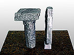
Made a sculpture. Instead of casting the cans and base together, as Johns did with “Ale Cans,” my sculpture’s dialog is mounted on marble, a classical, non-pop material. I start my dialog with the roots of Western art. However, his cans were cast in classical bronze; mine are contemporary aluminum. His cans were separated a bit less than 1/2 a can; my objects are closer, more involved, perhaps even invading each other’s space. There are other aspects of this dialog; it is one I’m afraid I’ll never have n person with Johns, whose work I admire greatly.
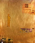
Also made a computer piece, which began as a vague comment on Homer. (We have a piece signed “H,” most likely a forgery; but the Homer statement is there.) All of a sudden, I was wrapped up in the work, as the images that I had chosen to assemble because of a vague resonance set up an esthetic and personal dialectic. It is called “The Contemplation of Nature.”
Finally, the “calligraphic” piece began to pull, after I glazed it with a semi-complementary. I am thinking that I might paint back into the “background,” as Mondrian and Kline sometimes did, and see what happens. I probably will call it “Essay,” after Montaigne’s coining of the word, to mean “trying [to make sense].”
 in progress: "Essay" acrylic on canvas 36x48 in.
4/20
Before tackling the red calligraphic piece Essay, I rethought the cellophaned calligraphic piece. The over-all cellophane has now become a calligraphic cellophane “river,” about 1/4 the canvas and located about 1/3 to the left. The main field of the canvas is gray, with some subtle color hints of how the grey was conceived. It is heavily stroked, mostly random. There is a peek-through in the cellophane river, where a “moon” can be seen, the moon being a preserved part of the universe I am part of. Below that level, the “moon” is the only gessoed canvas showing, the real basis of this whole expression being an expression, a painting.
4/28
 The “cellophane river” piece (4/20) has become “Thinking Like Heraclitus.” It will have a piece of cardboard with two kinds of black on it, “tacked up” with trompe l’oeils tacks. All that fits the idea. Also, there is a collaged old serigraph monoprint that became appropriate as the theme of changes from emerged. I wish that such pieces, of thought deeply felt and not just sociological, had a better reception these days. I’m liking the look, the fun, the trickery, and the re-invigoration of old work. Perhaps more to come from this piece; I’ve pulled some paint pieces that might richen the metaphor.
5/8
5/9
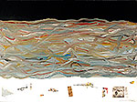
“Thinking Like Heraclitus” looked too thought-out. I used another monoprint that matched up better (antithesis) of the black cardboard, then angled it for movement. (These were gut feelings that I understood later.) Tried a triangular piece of roof shingle (tar) in various places. Liked it under and out of the cellophane river. Why not more tar. Two small pieces added. Tacked on the round stencil I used to preserve the white circle (now, under the cellophane)--picked up the circle of course; also added another, unexpected direction to the brush strokes in the gray field. Moved stuff around until things lined up and still fought. This may be finished.
5/12
 "Essay” (4/8) has become “Bring It.” The earlier idea, painting into the reddish ground, combined with enhancing the figure-like shapes in the upper right. Also added: the announcement of the 1913 Armory Show, feet in space (recalling “Several, In flux” and others looking down into heaven or sky), a moving figure, and some Johns-like references to previous works. This moving figure is not yet right, and the runner who is “bringing it” may be too obvious also.
Also, glued down the river in “Thinking Like Heraclitus,” as this piece gets closer and closer to being locked in.
5/19
Finished “Thinking Like Heraclitus” with a few moves, to get sweeping, hidden arcs and also better relationships. I hope the remaining discomfort is what the piece calls for, and not a twinge that it’s not yet right. Since I can’t see changing anything now (nor stowing the piece in case a revelation comes) I’m going with it.
5/30
Memorial Day and other middling mayhems have kept me from the studio, but there are always art “projects,” usually requested. Here are some from the last two weeks:

![]()
![]()
![]()
![]()
![]()
6/4
Two paintings worked on, one gone off the rails, the other still sitting there, tempting a decision. Maybe something will come of this.
6/7
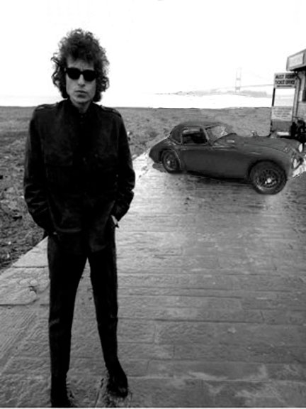
Did Studio Boogie Woogie, a computer-manipulated drawing. Actually, it did me.
6/11
What a surprise. Both works (6/4) not only got on track, but are taking off. “Bring It” is now going to be “Coursings,” for the flow of the runner/stroke in the upper right, the blurred figure at the bottom, and the calligraphic lines with their blood-suggesting red edges. Everything moves and circulates. May or may not hint at Art as part of this, with the Amory Show poster. Will not use the feet, although their implication is in the other piece, the one I thought “off the rails.”
This other piece, also a 36x48 in. acrylic, now has the additional dimension that looking down the feet had in “Coursings” (“Bring It” ) work. Besides the flow through the paintings, I want something INTO them, to suggest the other dimensions. So, in this new piece, there is a deep, velvety “sky” band across the top 1/4 of the piece. After 4 coats, it’s looking about right. The middle 1/2 of the piece is random roaring strokes of various colors. This doesn’t work yet, but I’m going to load up the brushes with paint on the next go, then, I think, chop-blend them--something to get a flow. At the bottom 1/4 the plain canvas will support detritus: wood, pics of an old muse taking a pic, scraps of paint--don’t really know. But, I think this is going to be a good piece. Maybe called “Flows”?
6/13
Work on both “Coursings” and “Flows” going well. Took a while to decide how to place and tear apart the lower figure in “Coursings.” Wanted it to fit and yet be distinct, as well as leverage the composition in the right way. In “Flows,” glazed yet again the “sky, using more gloss and more ultramarine and thalo to deepen it. The middle 1/2, the brushed flows, went very well, adding to what I thought it could be, and surprising me with things I could riff on.
6/16
Tore off more of the figure in “Coursings,” so it would fit in with the flow, literally. Have laid down the objects in “Flows,” and like the balance of the real (wood) and thought (sketch with diagrammatic sidebar), formed and accidental. Will see if both of these hold up next time I go into the studio. Before I do anything, I have to start another piece, so I’m not faced with nothingness when I finish the other two.
6/17
Walking on the beach, I was three steps past this piece of driftwood when the image grabbed me. Looking like a nasty rabbit or a rabbit-wolf, I wanted it as a resource. Before I got home, I had the idea of commenting on Poons and the detached-from-nature ideology of some art.
Then began the selecting of other resources, drawing, working. The “stage” was the hardest, to make it belong yet stand out, and to have it reflect the glitz-order of detached intellectualism. I hope for, and see more and more, an attached (to nature), non-utopian world view. I wonder what it takes to achieve the balance of mind and senses, form and inspiration that appear in great periods like the Renaissance.
6/19
Finished Coursings by tearing away more of the collaged figure, until she fit the shapes and created the feeling I wanted. Hands appeared (in the original photo, the woman had her hands in her pockets), and the situation became less fixed.
6/20
Finished Flows this morning. The bottom 1/4, with all the collaged objects excited me--don’t really know why. The drawing ended up end up. That’s okay, but not as much fun. Maybe that’s it--the whole piece just ran away with itself, and the upside-down drawing suggests too much thinking. Either way, it’s not a real problem. I liked working on the drawing, an old one. It has great light.
Tonight I finished a computer piece at home. Called Long Look, I started it yesterday, by sandwiching a photo of the painting Coursings, the old computer print A Moment, and an ancient work that was drypoint on acrylic. Eventually the looking man got trashed, and the sitting guy took over, which meant that about half the work had to be redone/repositioned. I’m especially happy with the graceful hand in the lower right, in its arched space. It might be holy or renaissance.
6/26
After I laid in the ground of my next painting, it looked so rich and subtle, a soft shimmer of slightly colored grays, that I began to think of ways to keep it. Several thoughts later, it remained destroyed, but in a more interesting way. Now, I am going to reflect on “Las Meninas.” Good for lots of other artists. Velasquez himself fought that painting be considered a learned endeavor.
So, I did a study that combined smearing “Las Meninas” into a flow, adding in some flowing, abstract strokes, and placing myself in the position Velasquez had in his painting.
Looked way too dark, and almost hellish, myself included. Now, I’m going to go lighter, along the lines of the current in “Flows.” Have to wrestle with the painter, position and depth. It can’t be just an illustration.
7/7
Back from a week's vacation. A couple of things I saw interested me, relating to the paintings. Space and intermingling were the main areas.
![]()
![]()
7/11
 The flowing current idea is gone from the Las Meninas riff. I’m working on a gray, “glowing” ground, on which to paint myself, as the artist at his easel, and the open doorway in the back. What other bits of phenomena are going in, I don’t know. After my first washing in of artist-self, I moved myself to be where Velasquez has put himself. He was right!
7/13
Thinking about it and working some more, Velazquez was right about the artist, but would be wrong, in this age, about the mirror and the doorway. I’ve migrated them. As I was working out another study for the painting, I got enticed into working with the previous study for it, this time as a computer print. Two days of interesting aggravation later, I completed the computer piece, called Meanders. Will start on the painting tomorrow. Although the artist, reflection, and doorway will be in roughly the same place as in the computer piece, I am excited about the new places working on this painting will lead.
7/14
A boy appears to have drowned in the Lake, near us. I am going to incorporate the image of a swimmer, from my print Ying Yang Shi, into Ars Longa Est, the piece inspired by Las Meninas.. The more I thought about it, I am attracted to letting Ars Longa Est sit in the studio, adding to it as real events flow through the world. Meanwhile, I’ll let loose on some smaller pieces.
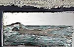 the swimmer from Yin Yang Shi
7/24
One of the smaller pieces going fine, somewhat resembling Discernible. This piece has the swimmer, some smudged, vague “writing,” and a sales tag with a piece of blue from a palette affixed.
Ars Longa Est, however, wasn’t working. Flux didn’t emanate from the gray layers I had down; and the artist and swimmer just floated above everything. I painted a much lighter gray with a color current flowing through it. This might work. However, that changed the artist/ground relationship so much that I’m going to shrink the artist, to get him back into the feel of Velazquez’s artist, yet keep the modern “upgrade.” This has been a fun and learning-inducing puzzle.
7/27
12:30 AM While I haven’t yet finished the painting Ars Longa Est, another digital work has unfolded today. I call it The River is Long.
7/29
Away from home, watching my son’s dogs, I played around with images, mostly all photos I manipulated. I started out with images I just liked mixed stuff in and out, deleted, got new images, and came up with a playfully serious computer piece, The Game.
8/4
 Newest painting (“Senses”)is starting as composite of a painting I made of student sketching (which may become me) and red-line reduction of DFW airport concourse. I intend to create a flow over the concourse reduction, and sgraffito back to the lines.
8/9
My family visited this past week. I played around with the shadow of the Olympic torch lighter (“Shadow and Star”) and two other photos that became “Launch Composite.” These may get used in some future piece. Also working on poems-with-art book.
8/11
“Senses” (8/4) is changing. Instead of an impasto field with a sgraffito back to the formal lines, I’m going with glazes and scrubbing. Creates more of a whole. Also conveys the idea of our sensing things better. I’ve added a scrap piece of tape, that may look like a muse torso.
8/14
Art collectors and the Art establishment seem much better at collecting and establishing than at independent judging.
8/20
Finished Senses. The figure took some time, to give him a personality from behind. Added a little paint of the same hue to the back of the tape, which I had tranparentized with linseed oil--made it fit in better. I like that it looks sexy and frightening, still and moving at the same time.
8/29
Have been working on another 24 x 24 in. canvas, this time in oil. Swimming figure at bottom right, the main field is a current again, this time heading lower right to upper left. Some charcoal symbols or writing is in upper left, with far upper right having a real sales tag hanging down, with a piece of paint on it instead of a price. What the hell does all this mean?!
9/10
The swimmer has changed and changed back. I thought he might be a part of the “current” field, but that was just too illustrational. Went back to attacing a computer print on rag paper, in its own flow. Fiddled around until the right size and placement worked. Also tweaked the charcoal symbols, making them overpoweringly ugly; so they will have to be reworked. The price tag continues to work. Where, in the recesses of the sense of “right” do such things reside?
9/11
Did Pure Parallel Ah, computer. Just felt like painting for pure pleasure. May have been inspired to do so by Kathryn Arnold’s Phoenixlike.
9/15
Finished
Current, Ripped the big swimmer off the canvas. It dominated the flow rather than being in it.
Smaller guy works, not only mentally, but also picks up the color in the sales tag and relates better to the “writing/figures” in charcoal.
9/22
Working on several things. Sanded down two 14 x 10 in. brass plates, to do oil painting on them. The different directions of the sanding throw off light in a way to confuse “depth.” This main field echoes what I do in painting, but in a new way. I thought the brass particles might make an interesting basis for drawings, so I set the plates on good paper, as a diptych, as I sanded them. Used the particles to form a “border,” added in some drawing. Decided to do a semi-mirroring, placing objects in the same places on each half of the drawing, but making the content different. After doing a bit of that, did some more smearing, then some spray painting of aluminum and gold paint. More drawing and a bit of collage later, it’s starting to make a point, though still needs strengthening.
Also printed out some of the more interesting images I’d shot, made, or sketched, to use as bases for new paintings. As I was roughing out an idea in my sketchbook, I realized the images would also work as a computer print, making the necessary changes. Have spent a day on the computer piece, and it, too, is grabbing me. Called “Keeping in Touch,” the Muse (as Botticellis’s “Venus”) gazes on a wall with two windows and two weeds in snow up high in the piece, while tire tracks in the form of earth terrain from space are at the bottom. Gesture, deep knowledge, nature, deep questioning, and pure search.
9/24
Finished “Dual,” graphite, enamel, and collage on paper, 18x24 in., the drawing started 9/22. Immersed the two small printouts of computer art into the main field more by trimming the white borders. Spent more time than I thought I’d have to on the female figure, to avoid a clichéd look. Now she has some character, and it’s hidden even from me. The rest was mostly touch up of drawings for accuracy, then wipe-out to bring them into harmony with the rest of the work.
Also have done more work on the computer piece, “Keeping in Touch,” mainly getting the woman and the tire-tracks/Andes into a more pleasing relationship with the snow-capped weeds and the wall. These two have taken over from Botticelli’s beauty.
9/29
Finished “Keeping In Touch,” by altering main field for a little more definition of the warped weave and by warming and defining more clearly the wall with windows.
Started a new painting based on “Keeping In Touch,” because I wanted to see what direction paint would take me. The painting is called “Away,” because it is about being away from reality and moving away. The mountains-tracks at the bottom of “Keeping In Touch” have been replaced with brushy black car tracks. The main filed is a slashing red with a dampening glaze over it. The wall “bleeds,” and the weeds are going to stand on their own, echoing the tracks. The big mystery is whether the Renaissance beauty or something else will peer in from the upper right.
10/6
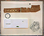
From an estate sale, I picked up a Cornell-like box of glass eyes. I pulled the eyes and some of the mounting papers they were on, but left a raised platform and a wonderfully-aged scrap of paper (brown, with fairly illegible black ink descriptions of different eyes). The paper was in the right place, and looked a bit like a side view of a valley. Then I went looking for inspiration. On the raised platform, I put in some paint scraps that may or may not suggest a sunrise landscape. I had no idea what would come next.
Next time in the studio, some scraps from an old SLR camera and something from inside an old Iomega disk survived the trials and errors of stuff selection. The next time, the O ring of the camera and the piece of disk were moved around, along with experiments with placing the paint scraps. The original silver piece from the camera moved from where the head is now, and was changed to a darker piece. This had overtones of moon (below horizon) and human-made construct. The silvery piece from the disk was cut out, to look like the spinning disk that early human cultures portrayed as sun. It, too, has natural and mental aspects. Somewhere along the line, I saw a face “gazing in.”
After trying several sketches at home, when I came to the studio today, I sketched onto the linen the one I liked the best. Took several tries to get the upward glance right in charcoal and graphite, since the sketch had been just the narrower graphite. The working and re-working made the sketch more personal though--a price worth paying.
Today at least, I really like the piece for its hints of serene, not clearly seen landscape, emotional-yet-philosophical presence, fun textures and shapes, and subtle colors.
After I photographed the piece without the plexiglass cover, I put the cover on to see whether that could be clearly shot, turned around for the camera, and heard the piece crash to the ground! So, the plexi that had been the reason for doing the piece now has to be made again, at a cost of $119.20. This may or may not be funny.
10/14
An old photo I took from a second floor window of some kids walking on a broken sidewalk has been rattling around my mind and my “current working” folder. Folded it into the "Phoenix" computer piece I’ve been working on. Looks like it might be okay.
10/18
Working on “Not Known,” a 32 x 22 in. painting. As I was starting the main field a while back, a “Z” emerged. Put in the white wall with the two windows, and let it mellow. Next time in the studio, I thought of Zacharias, then of other really good painters who were not well enough known. Of how it was chance as well as talent and hard work that make success. Of how one learns to live with it. Was going to call it “Homage to the Not Known,” but thought it too limiting in scope and esthetic challenge. So, the “Z” is more hidden, and other things are yet to emerge.
10/20
"Phoenix" was a real struggle. It “got right” early (10/14), changed half way through, but the remaining half of the time was spent tweaking the intensities, colors, and edges of the objects.
10/24
Working up ideas for the second diptych drawing with the bronze dust borders. May not be as mirroring as “Dual.” I’m going to hold off actually painting the bronzes until I finish this second piece. From the dynamic relationship between the two pieces, the paintings will emerge. Have to be somewhat tighter with the paintings because I don’t think the bronze will take many changes, especially in placement.
Got the windows in the wall and the weeds next to the wall painted in “Not Known.” Windows too boring/lifeless. Weeds perfectly alive in their winter deadness.
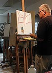
10/27
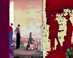
 Demonstration coming up, so I decided to do a study and then sketch it onto the canvas. That way, the mistakes/indecisions/redo’s will take up a lesser amount of time, and won’t put viewers to sleep. Working from “Phoenix” (10/20) images. Changes that I made as I sketched from the study: Chair smaller and higher, sidewalk as main field given a wide-angle warp, figures and tree sizes slightly adjusted so that they read right at the canvas size (24 x 20 in.) Called "Strands and Delineation."
Meant to take a photo of the sketched-in canvas, to overlay onto the study, then start fussing around to see if a computer print would develop. I think the ideas are strong enough to use the iconography for a while.
10/29
Started on the melding of a digital photo of "Strands and Delineation" underpainting painting into its computer study. Sixth revision starting to look possible. Emphasizes movement of figures at bottom, main field simple yet complex.
11/6
Finished "Prosaic Poem," which bagan as the melding of a digital photo of the underpainting for "Strands and Delineation" with an earlier computer study for it. Spent a very long time trying to get the two vase shadows the right colors and intensities. The one that overlays the whole work especially hard, because so subtle. This work takes away the more distanced feel of its originating painting sketch and computer study; no more DNA strands. What is there is more prosaic, shadows, walkers, petroglyph, yet still poetic in their fleeting existence, at different time spans.
11/14
Sowing. Works and applications to foundations sent off. Going through my digital Art Resources folder for creative alteration of and play with images. Have painted some on “Strands and Delineations” (10/27), early rapid brushworks field getting a gray glaze, figures going in, chair painted (looks like that may be finished). Changed the “Muse” in “Not Known” (10/18) from a Renaissance beauty (esthetics) to a pre-Colombian stone face (nitty gritty)--the piece is leaning towards a longer, deeper timespan.
11/18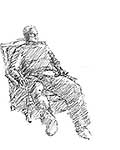
“After Shoveling,” archival ink, 10x8 in.
I did “After Shoveling” on the computer, for the first time being able to set up a tool (stylus with a modified "brush") that allowed me the spontaneity and touch of a pencil. Getting the idea for the sketch while I was sprawled in the chair, recovering, I asked Jane to take a bunch of shots. From these, I drew the sketch.
11/19 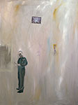
“Las Meninas” is the new name for the former “Ars Longa Est” (2/14, 24), because it is becoming more involved with art history. While still being about the flows in individual, human, and cosmos existences, I have put in Johns’ reference to these things (from “Untitled 1992), and am including “my” swimmer. Above Johns is a marked area that may be: where Johns slipped from, the next thing for him and us all, the mystery of knowing anything--I’ve no real idea. I’ve changed my mind about letting this piece sit around, Mona Lisa-like, to catch my ideas over a long period. Have to work on the painter, so he looks like me (not very hard) and so he looks loose and undetermined while having good paint quality (harder). The same need for a free “finish” is true for the “mirror” and the space the swimmer is entering.
11/24
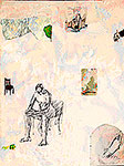
Finished In Medio Stat. Pulled a section from “Long Look” (6/20/2008). Juggled the ground/paint scrap relationship and colors. Same with the chair. Made the man himself painterly. Then I printed it. Made the man more painterly, using pastels. Added a real scrap of paint. The real artist mediates. I like the “real” stuff, the reproductions of real things, the vibration-like nature of the piece, which reflects the flow of matter/energy, understanding/dumbness. Hope and loneliness are in there, also.
12/3
Nearly all my time this past week has been spent in promotion, connecting, holiday visiting, flu, reading about poetry and art.
12/5
“Not Known” (11/14) has been changed again. There is no more “muse,” Renaissance, pre-Colombian, or otherwise. Now there is an art viewer, looking in his catalog, as a page in a book whose cover is a pastel of an art viewer looking in his catalog. This has something to do with the opening of Art Basel Miami, my thinking about how so much art has to be read about since Post Studio, or post-Structuralists, excluded the abhorrent Beauty and Expression from their social intervening, and the Art World generally. At the bottom of the work, I’ve emphasized the tire tracks as rawness of creative beginnings--a contrast to the inculcated sophistication of the Basel-type viewer.
12/8
Finished “Not Known” (11/14, 12/5), acrylic, pastel, charcoal and collage, 36 x 24 in. While a little raw in composition and slick in the “book” in the upper right, I like leaving it that way, reinforcing the feeling of the tension between making art and collecting it. I especially like the little slashy red impasto that runs under and disrupts the man looking at the catalog.
12/15
Working on the oil-on-brass diptych. Elements need to be larger than on “Dual,” the study (9/24). Might just use the four main elements, lower legs, young woman, chopped tree trunk on pedestal, and moving kids. Kids move in, while legs face out; kids move, while tree is dead, tree on pedestal while woman moves, woman moves in while legs face away. Serious play here.
12/20
Finished Woman Abandoned ed.25, inspired by a call by VIOart (Artmesh.com), in support for Fadime Sahindal, a kurdic woman, murdered in Sweden by her father on 21 january 2002.
The suddenly halted sidewalk, the woman looking away, the colors, the composition--the event and the metaphor are reinforced
12/24
Finished For Me. I’m very happy about this piece.
Worked on the bronze diptych (12/15). Going to have to study the shadowed legs in upper left. They don’t look real-ephemeral enough. First the real, then I’ll get the ephemeral. Have to be careful, since I’m painting in oil glazes.
12/29
Today was a messed up day. On the last cut on a piece of glass for a frame, the glass broke. Frame, art, and materials strewed about, with no chance of coming together. Then, re-configuring the mounting of my art-photo lights turned into a stripped bolt nightmare. However, the coffee I made turned out okay: consuming it, I decided against painting, although I had brought some studies from home for the diptych. Probably the best idea of the day. Often, working through a difficult or dry spot is the best way to go. Didn’t seem as if this was such a time.
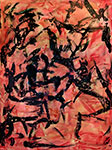
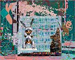
12/30
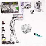
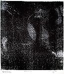
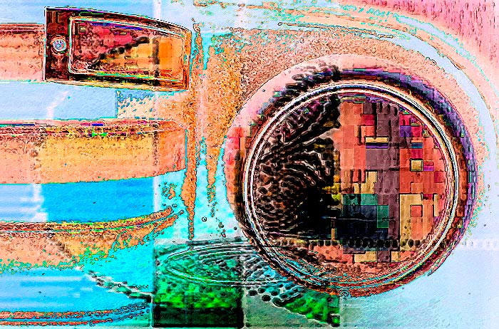
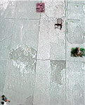
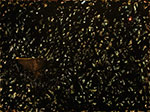
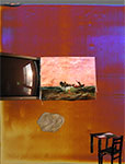
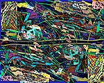
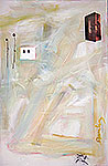
Finished Studio Boogie Color, a piece I’d been working on for over a week. I wanted the Mondrian “Broadway Boogie Woogie” references. B&W didn’t work. Experimented with coloring the B&W via computer, until the color worked. That, of course, changed all the relationships, so I had to erase, move, and scale until it worked. I like the subtle linkages, including some gestural overwrites.
Then, the print head of the very expensive pigmented inks was clogged, so I had to waste ink/money cleaning the heads, which didn’t work. Then, from experience, I printed part of the original, and THAT forced the shy yellow to print.
![]()
![]()
![]()
![]()
![]()
![]() Previous
Previous ![]() Top
Top ![]()
![]() Next
Next
Click on images below to ENLARGE
acrylic, oil, and collage on canvas, 36 x 48 in.
acrylic and tar on canvas
36 x 48 in.
ink
8 x 11 in.
archival computer print
15.5 x 12.5 in.
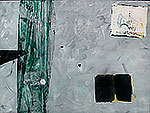
Thinking Like Heraclitus
acrylic and collage on canvas
36 x 48 in.
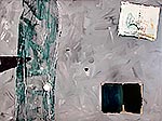
Thinking Like Heraclitus
acrylic and collage on canvas
36 x 48 in
.
Studio Boogie Woogie
Computer-manipulated Drawing
7 x 12 in
Glamor Unaware of Nature, Archival computer print, 12 x 15 in
Coursings, acrylic, 48x36 in.
 Flows, acrylic, 48x36 in.
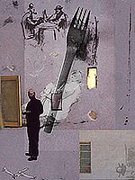
Long Look, Archival computer print, 16 x 12 in
Meanders, Archival computer print, 16 x 12 in
The River is Long, Archival computer print, 16 x 12 in
The Game, Archival computer print, 12 x 16 in
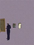
 Senses, oil on canvas, 24 x 24 in
Pure Parallel Ah,computer
Current, oil charcoal paper on canvas, 24x22 in.
Dual, graphite, enamel, and collage on paper, 18x24 in.
Keeping In Touch, archival computer print, 15.5x11.5 in.
 Forms, charcoal graphite acrylic collage on linen in plexi box 14x17 in
Click on images to ENLARGE
Phoenix, archival computer print, 15 x 12 in
Prosaic Poem, archival computer print, 15.5 x 12.5 in
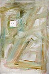
In Medio Stat, pastel, ink, acrylic on paper, 14 x 11 in.
Not Known, acrylic, pastel, collage on canvas, 36 x 24 in.
Woman Abandoned, archival computer print ed 25, 9x12 in.
![]()
For Me, ink on paper collage on board, 15.5x4.24x15x4in.
Studio Boogie Color, ink on paper, 11x14 in